Hand Lettering and Calligraphy Classes in Anchorage 2026
Hand lettering occupies an interesting position among contemporary crafts: it’s one of the few skills where the output is immediately useful — a lettered quote, a wedding envelope, a personalized card, a sign — but the learning process is also absorbing enough that many practitioners continue long after they have any practical need for another lettered piece. Unlike typing or computer-generated text, hand lettering carries the evidence of physical making in every letter: the variation in stroke weight from pressure changes, the slight inconsistencies that make each piece unique, the warmth of ink on paper that no digital font can replicate. Anchorage’s creative community has found a consistent audience for hand lettering workshops among calligraphers-in-training, artists diversifying into lettering, and people who simply want to make something beautiful with a pen. This guide covers hand lettering classes in Anchorage in 2026, the tools and styles involved, and how to develop a lettering practice beyond the first workshop.
Hand Lettering vs. Calligraphy: A Real Distinction
The terms are often used interchangeably, but they describe different practices:
Calligraphy is the art of writing with a traditional instrument — a dip pen with a metal nib, a flat-edged brush, or a reed pen — where the variation in stroke weight is produced by the tool itself as it moves through different directions of stroke. In italic calligraphy with a flat nib, thin strokes occur when moving along the width of the nib; thick strokes occur when moving across the full width. The tool makes the thick-thin variation; the hand provides only direction and pressure.
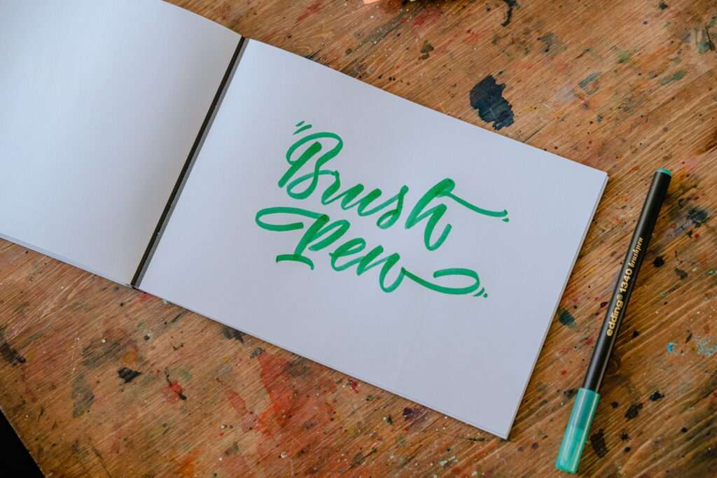
Hand lettering creates letterforms by drawing rather than writing — each letter is constructed from multiple strokes, often retracing and building up the form rather than completing it in a single fluid motion. Modern brush lettering (using flexible brush pens) sits between the two: the brush tip creates thick-thin variation through pressure variation (heavy pressure on downstrokes, light on upstrokes), but the letterforms are often drawn and refined rather than written in a single motion.
Most contemporary “hand lettering” workshops teach brush lettering with modern brush pens — a more forgiving entry point than traditional calligraphy with a dip pen, since brush pens don’t require ink loading, don’t spatter, and produce predictable results without the maintenance that metal nibs require.
Essential Tools for Hand Lettering
The tool selection matters significantly because different instruments produce fundamentally different letter qualities:
- Brush pens: The standard beginner tool for modern brush lettering. Tombow Dual Brush Pens (large tip for bigger letters, fine tip for smaller work) and Pentel Fude Touch pens are the most commonly recommended starting points. The flexible brush tip creates thick downstrokes with pressure and thin upstrokes with release — the foundational thick-thin pattern of brush lettering.
- Micron/fineliner pens: Used for monoline lettering (consistent-width strokes) and for the “faux calligraphy” technique where thick downstrokes are added by hand to monoline letterforms. Sakura Micron and Staedtler Pigment Liner are the standards.
- Dip pens with pointed nibs: The traditional calligraphy tool — a metal nib inserted into a pen holder, dipped into ink. Produces the most variable, expressive thick-thin contrast of any lettering tool but requires ink management and nib preparation. Nicholson 6B and Nikko G nibs are recommended beginner nibs; Higgins Eternal and Sumi inks are common starting inks.
- Broad-edge nibs: Wide flat-edged nibs used for italic calligraphy, uncial, and foundational hand scripts. The width-based thick-thin variation produces a different aesthetic from pointed-nib work — more architectural, less flowing.
- Smooth paper: Brush pens and dip nibs both work best on smooth, non-textured paper that doesn’t catch the tip or absorb ink unevenly. HP Premium Choice LaserJet paper (32 lb) is the standard recommendation for practice; hot-press watercolor paper and Rhodia notepads work well for finished pieces.
Foundational Strokes and Basic Letterforms
Hand lettering instruction invariably starts with basic strokes before moving to letters, because consistent letterforms emerge from consistent stroke execution. The foundational strokes for brush lettering are:
- Downstroke with pressure: Moving the brush tip down the page while pressing to spread the tip — produces a thick stroke that forms the main vertical and diagonal elements of letters.
- Upstroke with release: Moving the brush tip up the page while releasing pressure — produces a thin stroke that forms the ascenders, loops, and connecting strokes.
- Oval: A controlled oval shape combining the thick-thin transition — the foundation of letters like o, c, e, and the rounded portions of a, d, g, q.
- Compound curve: An S-shaped movement that transitions from thick to thin and back — the foundation of letters like s, z, and decorative flourishes.
- Ascender and descender loops: The loops on letters like l, h, b (ascending) and y, g, p (descending) that define the distinctive flowing quality of connected brush lettering.
Most workshop curricula spend the first session on stroke practice, then move to lowercase alphabet construction, then uppercase, then connecting letters, then developing individual style.
Popular Lettering Styles
Hand lettering encompasses a wide range of historical and contemporary styles, each with different tool requirements and aesthetic applications:
- Modern brush script: The contemporary brush lettering style most visible on social media, greeting cards, and wedding stationery — flowing, bouncy, and informal with deliberate thick-thin contrast. Taught with brush pens; beginner-accessible.
- Copperplate (pointed-nib script): The formal engraving-derived calligraphy style of 18th–19th century correspondence — delicate hairlines and swelling shaded strokes, extreme thick-thin contrast, precise letter constructions. Taught with pointed dip nibs; requires more practice to master than brush lettering but produces the most elegant formal results.
- Gothic/Blackletter: The angular, dense letterforms of medieval manuscripts — immediately recognizable from historical documents and heavy metal album covers alike. Taught with broad-edge nibs; the strong geometric structure makes consistent execution more achievable for beginners than Copperplate.
- Brush printing: Non-connected capital lettering with brush pens — each letter stands alone rather than connecting in a flowing script. Produces bold, expressive results and is often an intermediate step between practice strokes and full script.
- Faux calligraphy: Monoline letterforms (drawn with a fine tip pen at consistent width) with thick downstrokes added by hand as a second pass. Produces a calligraphic appearance without requiring pressure-sensitive tools — useful for lettering on surfaces where dip nibs or brush pens don’t work.
Hand Lettering Workshops in Anchorage
Anchorage’s hand lettering workshop landscape includes both introductory brush lettering sessions and more advanced calligraphy instruction. Most beginner workshops run 2–3 hours and provide brush pens, smooth practice paper, and a guide sheet — the guide sheet shows the letterforms and stroke directions for the style being taught. Participants typically complete the alphabet and a short practice phrase in the session, leaving with their practice sheets and a sense of the basic stroke movements.
Prices run $35–$70 for single-session workshops, with materials included. Multi-session courses (4–8 weeks) are available for students who want to develop a more complete calligraphy practice, particularly for pointed-nib Copperplate instruction, which benefits significantly from guided practice over multiple sessions.
Anchorage craft studios, art supply stores, and independent lettering artists all host workshops — checking Eventbrite and local Facebook creative communities surfaces the most current schedule. Summer months tend to have more single-session workshops; autumn and winter see more multi-week courses as creative energy turns inward.
Developing a Practice
Hand lettering improves most reliably through consistent short practice sessions rather than occasional long ones — 15–20 minutes of stroke practice daily produces faster skill development than a single 2-hour session per week. The muscle memory involved in consistent pressure control, consistent letter proportions, and consistent spacing develops through repetition over weeks and months.
Many practitioners keep a dedicated practice book — a bound notebook used only for lettering exercises — and work through the same foundational strokes repeatedly, tracking their own improvement over time. The practice book becomes a record of skill development that’s also motivating to look back through. Anchorage craft workshop participants can show and sell their finished work at year-round events including the Anchorage Market & Festival, the Anchorage Native Arts & Culture Festival, and the Alaska State Fair. Our free things to do in Anchorage guide covers the art supply stores and creative community spaces where Anchorage’s lettering community gathers. Our Anchorage hiking guide covers the outdoor environments whose forms and textures inspire the natural motifs — fireweed, mountains, ravens — that appear frequently in Anchorage lettering compositions.
Photo by Yan Krukau on Pexels.


No comments yet.